Brand book
ARCA
Arca Academy of Architecture
One set of rules for every medium: the mark, the palette, the typeface and the signature devices. A layout built from this page reads as ARCA.
Revision 1.0
Logo
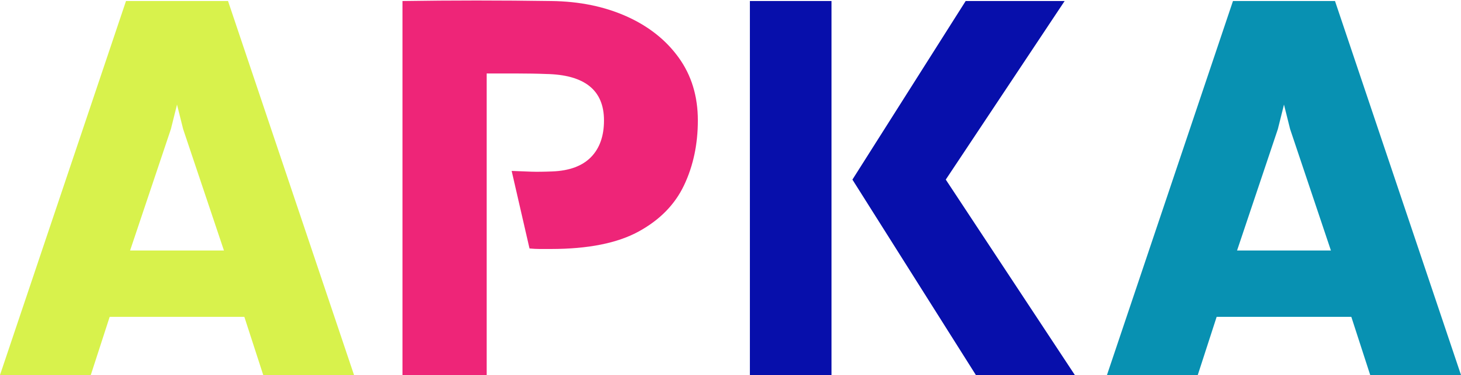
The primary mark is the ARCA acronym set in Kreadon ExtraBold and converted to outlines. Four letters stand for the four study tracks, and each one keeps its own colour.
Colour
The default version. It sits on white or cloud backgrounds — on the site, in documents and in decks.
arca-logo.svg

White
For dark sections, photography and merchandise. The only version allowed on graphite and on the base background.
arca-logo-white.svg
Graphite
Single-colour print, stamps and any medium without colour.
arca-logo-black.svg

Monogram
The first letter in lime inside a graphite circle. Avatars, favicon, social profiles, sizes under 48px.
arca-monogram.svg
How the mark is built
The order of letters and colours is fixed: it mirrors the structure of the programme.
- AArchitecture#D8F24C
- RReconstruction#EE2578
- CComposition#070FAB
- AAuthorial supervision#0891B2
Clear space and sizes
Keep clear space of at least half the height of the mark on every side. No text, shape, photograph or layout edge enters it.
Minimum width of the mark is 120px on screen and 30 mm in print. Below that use the monogram.
Rules
Always use the ready file from public/assets/logo — the letters are outlines, so no font is needed to render it.
The colour version lives on white and cloud backgrounds.
On dark backgrounds and over photography use the white monochrome: the ultramarine K scores 1.38 on graphite and disappears.
The proportions of the mark are 3.9 : 1. Scale it as a whole, never in parts.
The SPASK emblem is a partner mark: it stands one clear space apart and never locks up with the acronym.
Never
Reorder the letters or recolour them with other palette values.
Place the colour mark on a dark background, on photography or on a coloured tile.
Stretch, slant, outline, or add a shadow or gradient.
Retype the mark as live text instead of using the file: the kerning and the weight will drift.
Use the logo of the site developer as the academy mark.
Change the monogram background to an accent colour or swap the circle for another shape.
Colour
Four accents, six neutrals and two utility colours. No other values appear in layouts.
Accents
Lime
RGB 216 242 76
Lead accent on dark: buttons, numerals, the triangle, in-text highlights.
On white — 1.26 (not for text)On graphite — 13.86 (AA)
Fuchsia
RGB 238 37 120
Primary action and the star: application button, icon tiles.
On white — 4.06 (AA, 24px and up)On graphite — 4.29 (AA, 24px and up)
Ultramarine
RGB 7 15 171
Large block backgrounds and the form, the cloud, the third letter of the mark.
On white — 12.61 (AA)On graphite — 1.38 (not for text)
Cyan
RGB 8 145 178
The fourth track: point markers and captions on dark.
On white — 3.68 (AA, 24px and up)On graphite — 4.73 (AA)
Neutrals
White
RGB 255 255 255
Background of light sections and text on dark.
Cloud
RGB 238 238 238
Tiles and cards inside light sections.
Line
RGB 217 217 217
Dividers and connector lines on light backgrounds.
Card
RGB 31 31 31
Dark cards inside both light and dark sections.
Graphite
RGB 26 26 26
Main dark section background and text on light.
Base
RGB 32 32 32
Page background, the bottom layer.
Utility
Steel
RGB 43 101 133
Third plane: the rhombus, social buttons, utility captions on light.
On white — 6.36 (AA)On graphite — 2.74 (not for text)
Error
RGB 255 0 0
Forms only: the required field asterisk and error text.
On white — 4.00 (AA, 24px and up)On graphite — 5.25 (AA)
Withdrawn values
These shades appeared in layouts as accidental duplicates. Replace them with the canonical value whenever the block is edited.
- #FF1F8E#EE2578
- #E93B81#EE2578
- #DFFF3B#D8F24C
- #D3F23D#D8F24C
- #2563EB#070FAB
- #0057FF#070FAB
- #000EB0#070FAB
- #00B4D8#0891B2
- #2D6487#2B6585
Rules
One lead accent per screen; the rest work in points: a numeral, a shape, a marker.
Lime lives on dark only: 13.86 contrast on graphite against 1.26 on white.
White text on fuchsia starts at 18px Bold: 4.06 only covers large type.
Ultramarine is a background and text colour on light (12.61). On graphite it is unreadable (1.38).
Cyan as text works on dark only (4.73); on white it is a fill colour.
Never
Introduce new shades for a single layout instead of the canonical ones.
Stack accent on accent: lime on fuchsia, cyan on ultramarine.
Set text in steel on a dark background — 2.74 contrast.
Use the utility red anywhere outside forms.
Type
Kreadon is the only typeface of the brand. System faces are allowed as a fallback when the files cannot load.
Kreadon
A local family of seven weights, from ExtraLight 200 to ExtraBold 800. Loaded from the @meetorra/fonts package through the --assets-font-kreadon variable.
ABCDEFGHIJKLMNOPQRSTUVWXYZ 0123456789
Weights
- Academy of architecture200 · ExtraLightNot in use
- Academy of architecture300 · LightNot in use
- Academy of architecture400 · RegularWorking
- Academy of architecture500 · MediumWorking
- Academy of architecture600 · DemiNot in use
- Academy of architecture700 · BoldWorking
- Academy of architecture800 · ExtraBoldAccents only
Type scale
55/159 px · 500 · leading 1.0
Display
The first screen. One line across the container, never repeated in the layout.
24/64 px · 500 · leading 1.0 · uppercase
Section heading
Opens every block. Always uppercase, one or two lines.
18/32 px · 400 · leading 1.2
Subtitle
A single sentence under the section heading that explains it.
48/96 px · 700 · leading 1.0
Large numeral
Item numbers and statistics. Colour cycles through the accents.
16/24 px · 700 · leading 1.2 · uppercase
Card heading
Headings inside cards and lists, uppercase.
14/16 px · 400 · leading 1.4
Body text
Paragraphs and descriptions. Measure no wider than 530px.
14/14 px · 500 · leading 1.4
Caption
Utility labels, tags and table values.
Rules
Three working weights: Regular 400, Medium 500 and Bold 700.
ExtraBold 800 is reserved for the mark and large numerals.
Uppercase belongs to section and card headings, never to paragraphs.
Large sizes take 1.0 leading, body text takes 1.4.
Leave tracking alone: the face is drawn for the default value.
Never
Mix Kreadon with another typeface in one layout.
Use ExtraLight, Light or Demi — they break the rhythm.
Stretch the face or fake a weight with an outline.
Signature shapes
Four geometric forms are the second identifier of the brand after colour. Each one keeps a fixed colour.
Star
#EE2578
Accent of the first screen and of badges. The only shape that carries text on top.
Triangle
#D8F24C
Direction and movement. A large background patch on light sections.
Rhombus
#2B6585
Third plane: small elements near the section edge.
Cloud
#070FAB
A calm backdrop under photography and cards.
Rotation
Four positions are allowed: minus 15°, 0°, 15° and 90°. Arbitrary angles break the form.
- -15°
- 0°
- 15°
- 90°
Rules
A shape is a decorative layer: it sits under the content and never catches the cursor.
No more than two shapes in the decorative layer of a section. Shape icons inside the content do not count.
The colour of a shape is fixed and does not change between sections.
A shape may be cropped by the edge of the screen — that is the intended device.
Sizes run from 24px as a marker to 600px as a background patch.
Never
Outline a shape, fill it with a gradient or add a shadow.
Place a shape over text, over a face in a photograph, or over the mark.
Rotate to an arbitrary angle or mirror the form.
Draw new shapes in this style.
Devices
The recognisable details that make a layout read as ARCA even without the logo.
Pill buttons
Pill radius, Bold 16px, 32 by 12 padding. Fuchsia carries the primary action, lime the secondary one.
The academy teaches design inside real studio practice.
Lime highlight
A short phrase in a lime pill inside a paragraph. Once per section.
Numeral card
Card background, 20px radius, ExtraBold numeral, Medium 14px caption.
Composition
Marker: dot and line
A 12px colour dot and a 1px white line under the item heading.
Background rhythm
White sections alternate with dark ones: one or two light sections between two graphite ones. Ultramarine appears once per page, on the application block. Grey is never a section background — it belongs to cards.
- Icon
- Card
- Block
- Pill
Radii
Four values for the whole site; nothing else is used.
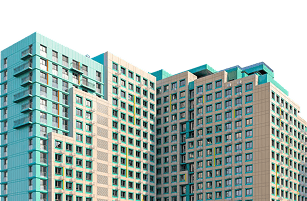
City photo layer
Saint Petersburg blocks in the lower right of the first screen: the photograph runs under the content and is cropped by the edge.
- Container
- 1324px
- Gutters
- 16px
- Measure
- 530px
Grid
Rules
A 1324px container with 16px gutters is shared by every page.
Vertical section padding: 48px on mobile, 120px on desktop.
Heading, subtitle and content align to the left edge of the container.
Numerals in lists and statistics cycle through the accent palette.
A dark section gets one shape, a light one gets a large background patch.
Never
Centre long paragraphs or section headings.
Mix different radii inside one block.
Place two light or two dark sections in a row.